The one thing you truly cannot abide is bad writing. And darling, the script for "The Real World" is an embarrassment. It’s a low-budget, poorly edited flop that frankly insults your high standards for narrative quality.
This print is your official, scathing critique—a public declaration that you tried to engage with the primary content, and it failed spectacularly on every measurable metric.
The Dialogue was Poor. (No wit, all small talk.)
The Pacing was Off. (Too much waiting, not enough action.)
The Supporting Characters were Shit. (Zero depth, zero motivation, all background noise.)
The aggressive red underlines are not suggestions; they are emphatic evidence, proving that your defenses against reality weren't stripped away—they were simply bored into submission. The heavy marking is the final, undeniable highlight of the true weakness: Reality's mediocrity.
This print is the sarcastic, self-aware acknowledgment that the messy soul belongs in a thrilling, high-stakes plot, not this pedestrian mess. It’s for the discerning viewer who gives the universe exactly what it deserves: One Star. Would not recommend.
Who Needs This Print?
For the individual whose personality shifts the moment they realize they are living in a bad simulation.
For those who understand the true power dynamic: you don't reject reality—reality rejects you because your narrative demands are simply too high.
If your preferred scripts include "morally grey" character arcs, stakes that actually matter, and dialogue that doesn't involve discussing the weather.
The perfect, knowing nod to the specific frustration of finding reality attractive only when it is utterly fictionalized.
Hang this where it reminds you: You might be formidable, but everyone has a limit to the amount of mediocre content they can consume..
The Specs
Museum-quality posters made on thick matte paper. The stark white background provides the perfect, honest surface for the declaration to be stamped upon.
· Format: True1:1 Square Ratio. (The only honest, balanced, and uncompromising ratio for this collection.)
· Type: Unfiltered, original hand-rendered black type on stark white. Specific lines and words are accented in stark red—digitally inserted to ensure inescapable focus. Professional execution, savage tone.
· Paper thickness: 10.3 mil
· Paper weight: 189 g/m²
· Opacity: 94%
· ISO brightness: 104%
· Paper is sourced from Japan
The one thing you truly cannot abide is bad writing. And darling, the script for "The Real World" is an embarrassment. It’s a low-budget, poorly edited flop that frankly insults your high standards for narrative quality.
This print is your official, scathing critique—a public declaration that you tried to engage with the primary content, and it failed spectacularly on every measurable metric.
The Dialogue was Poor. (No wit, all small talk.)
The Pacing was Off. (Too much waiting, not enough action.)
The Supporting Characters were Shit. (Zero depth, zero motivation, all background noise.)
The aggressive red underlines are not suggestions; they are emphatic evidence, proving that your defenses against reality weren't stripped away—they were simply bored into submission. The heavy marking is the final, undeniable highlight of the true weakness: Reality's mediocrity.
This print is the sarcastic, self-aware acknowledgment that the messy soul belongs in a thrilling, high-stakes plot, not this pedestrian mess. It’s for the discerning viewer who gives the universe exactly what it deserves: One Star. Would not recommend.
Who Needs This Print?
For the individual whose personality shifts the moment they realize they are living in a bad simulation.
For those who understand the true power dynamic: you don't reject reality—reality rejects you because your narrative demands are simply too high.
If your preferred scripts include "morally grey" character arcs, stakes that actually matter, and dialogue that doesn't involve discussing the weather.
The perfect, knowing nod to the specific frustration of finding reality attractive only when it is utterly fictionalized.
Hang this where it reminds you: You might be formidable, but everyone has a limit to the amount of mediocre content they can consume..
The Specs
Museum-quality posters made on thick matte paper. The stark white background provides the perfect, honest surface for the declaration to be stamped upon.
· Format: True1:1 Square Ratio. (The only honest, balanced, and uncompromising ratio for this collection.)
· Type: Unfiltered, original hand-rendered black type on stark white. Specific lines and words are accented in stark red—digitally inserted to ensure inescapable focus. Professional execution, savage tone.
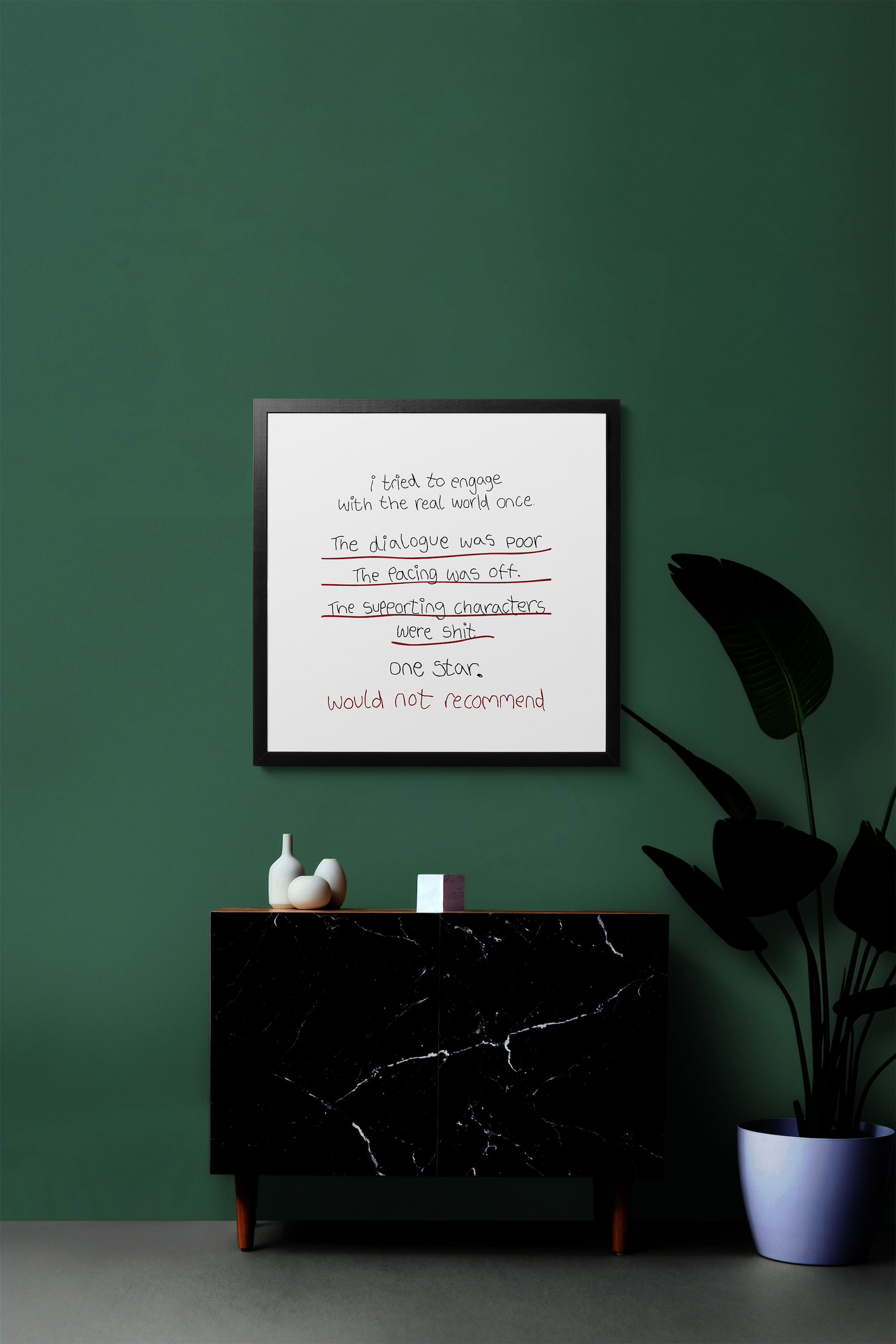 Image 1 of 6
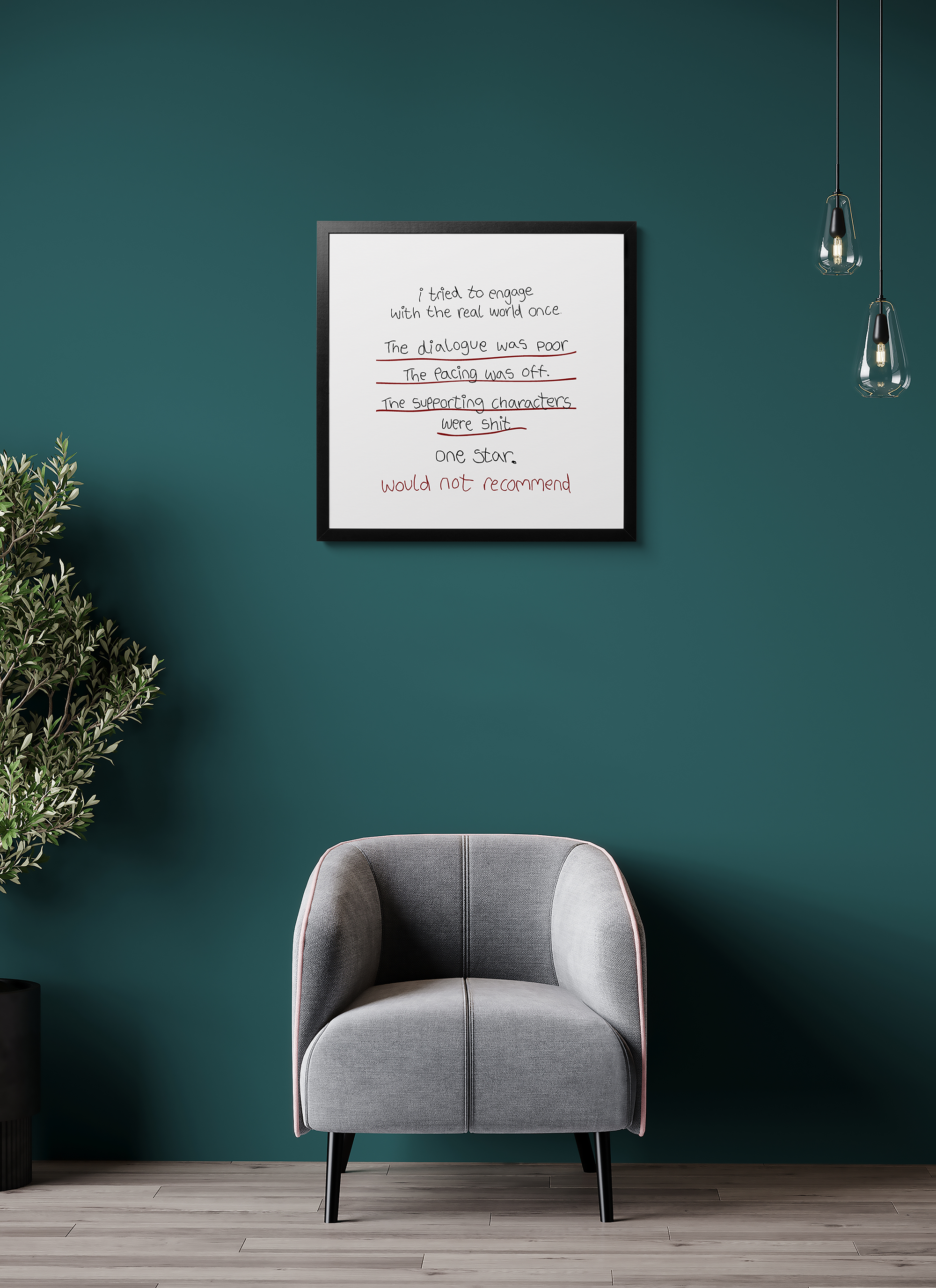 Image 2 of 6
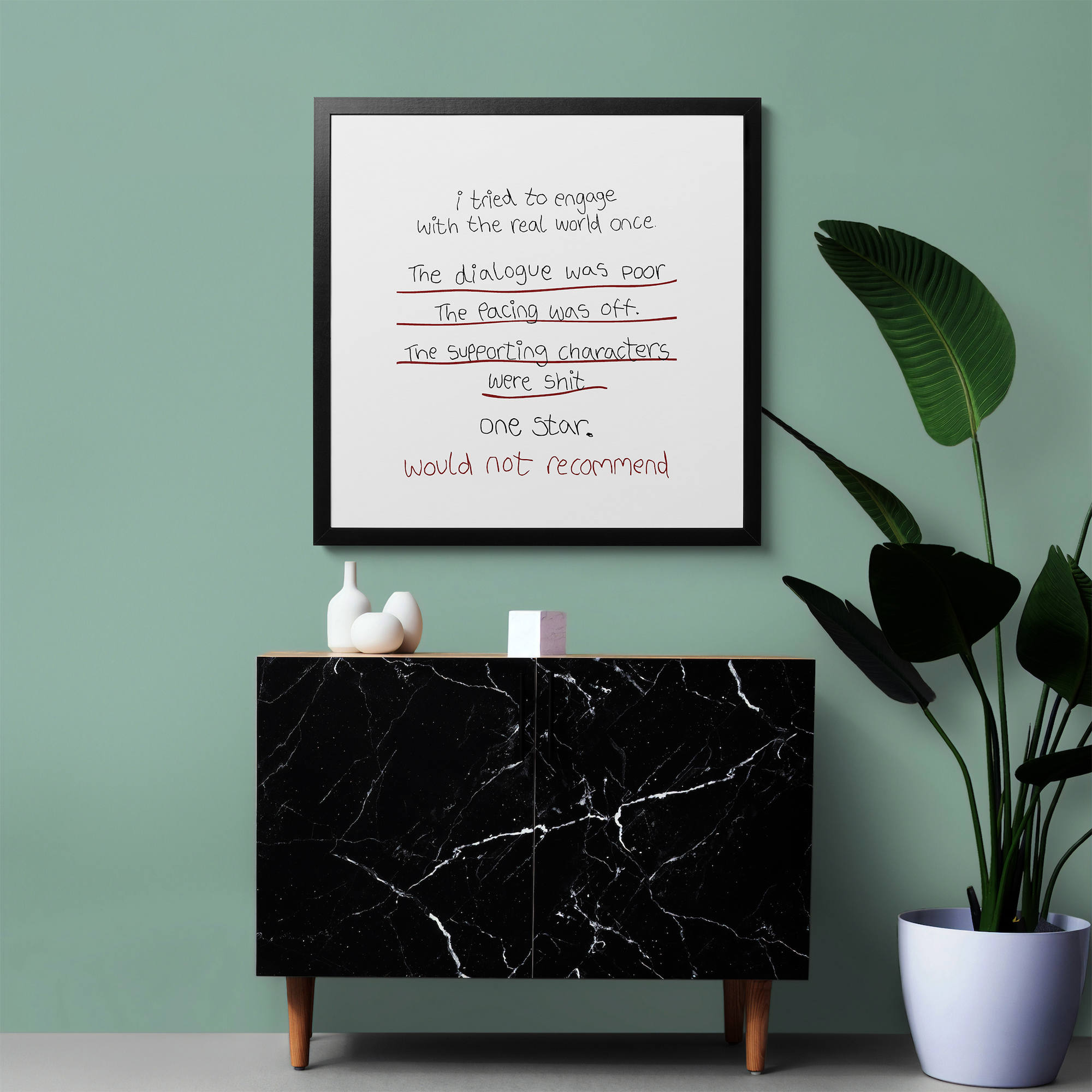 Image 3 of 6
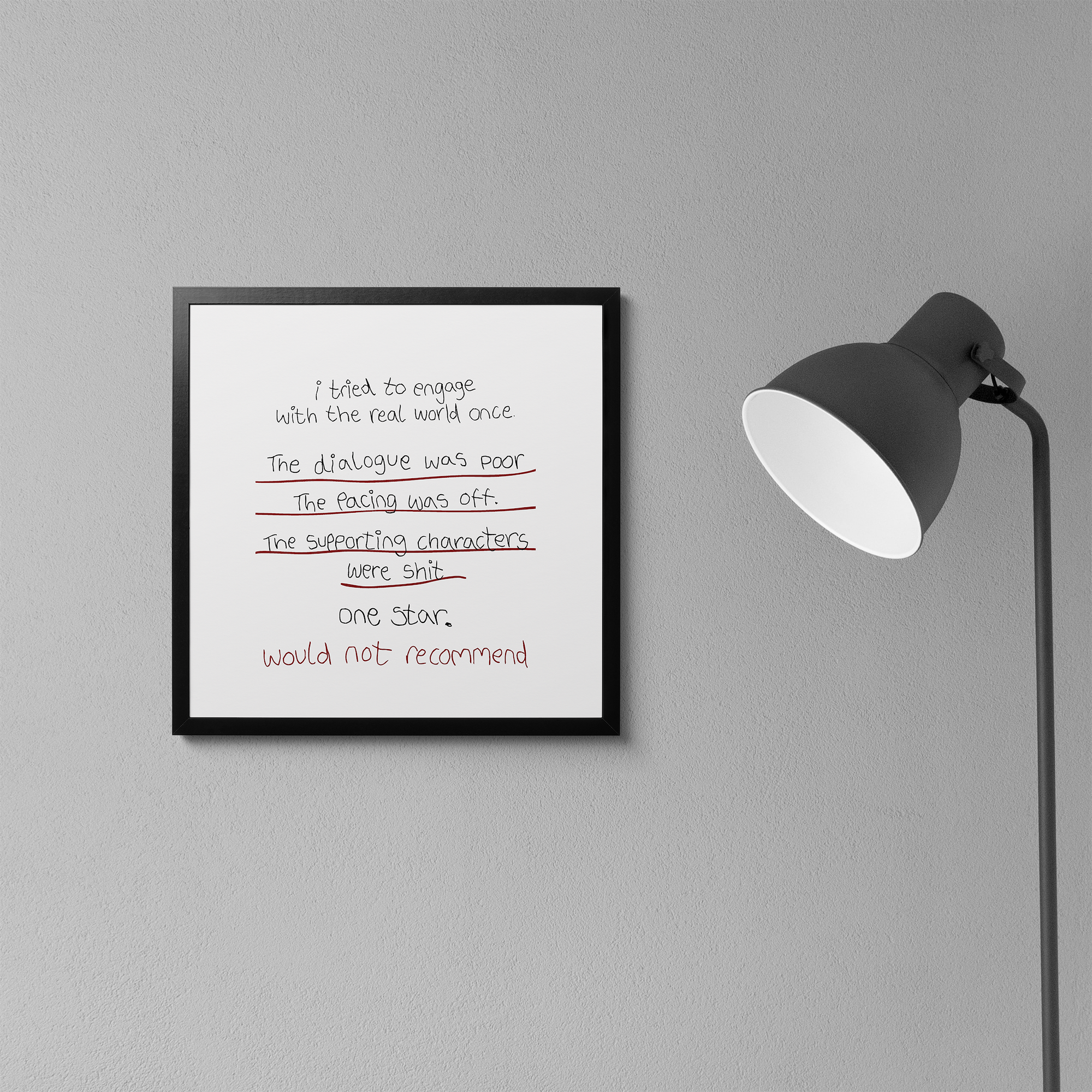 Image 4 of 6
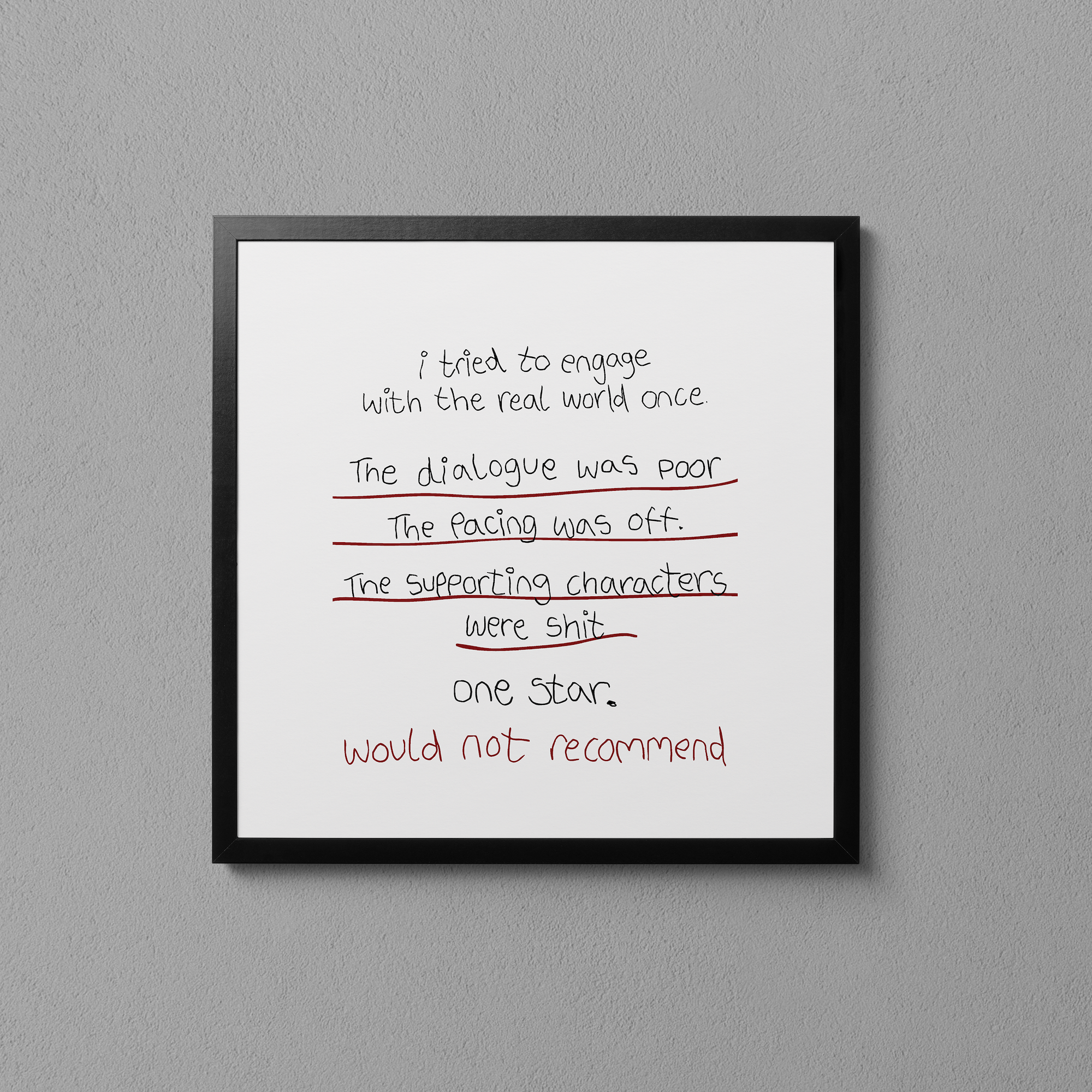 Image 5 of 6
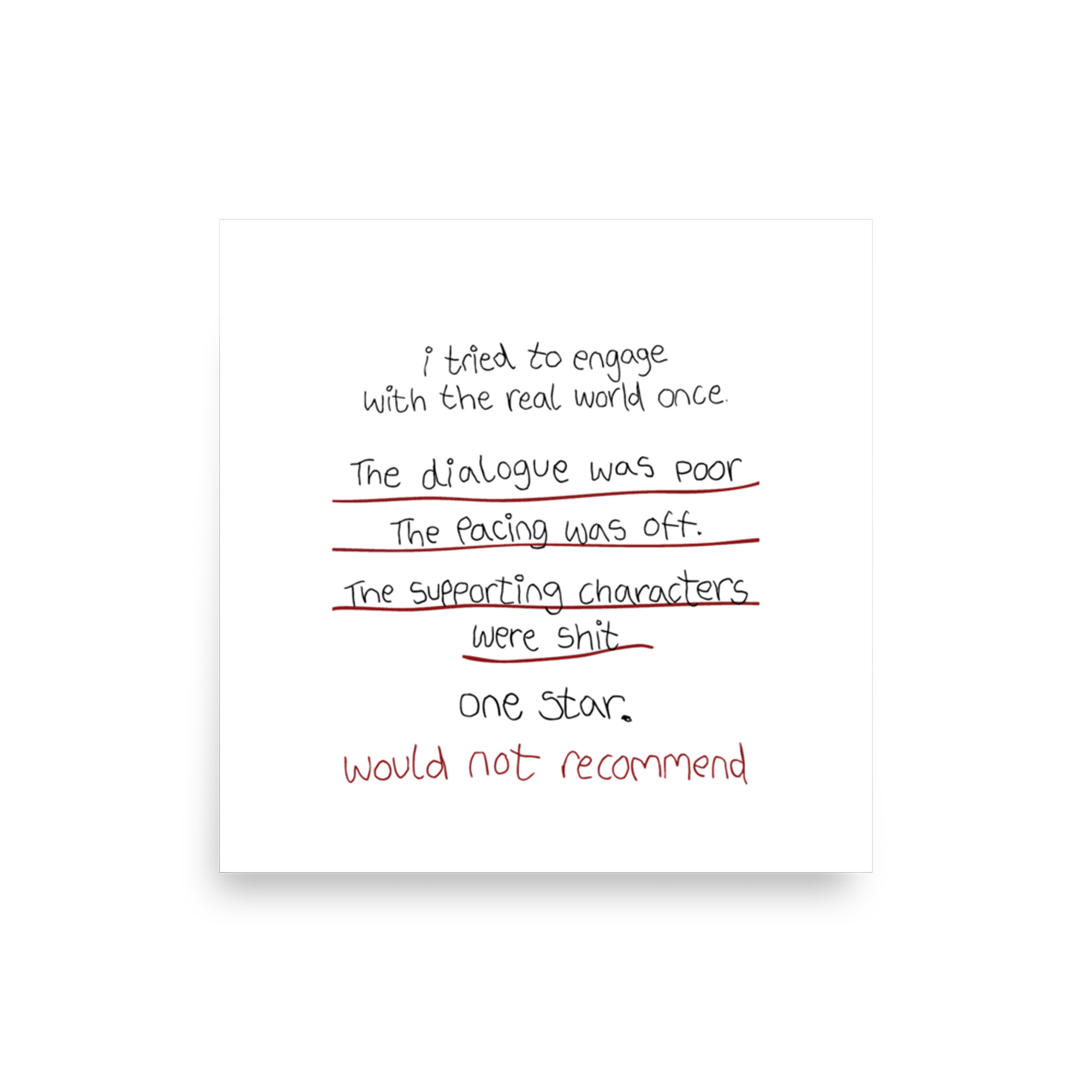 Image 6 of 6